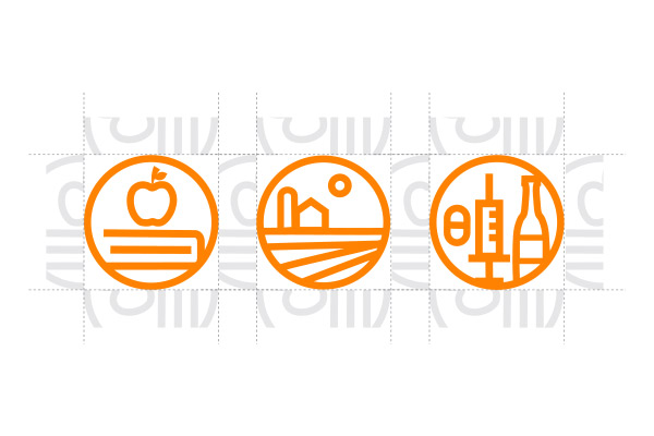
Grand Challenge Icons
The Grand Challenges represent complex, interconnected, large-scale, volatile problems that create uncertain futures for Tennesseans. To show these complex issues, the Grand Challenge icons have been developed to help categorize and identify Grand Challenge stories in print and digital media.
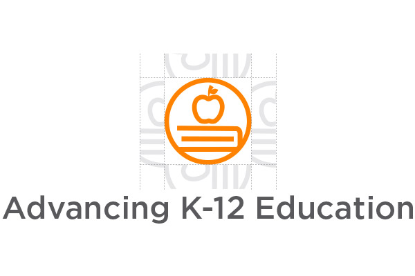
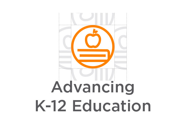
Advancing K-12 Education
Strengthening Rural Communities
Overcoming Addiction
They are not logos and should be accompanied with a primary UT System logo or the UT System Icon depending on the audience and obvious connection to the University.
Download the IconsSpace, Size and Proximity

Minimum Size:
The minimum height for the Grand Challenge icons should never be smaller than 0.5556 inches or 40 pixels for digital screens. However, the preferred default height is 0.6944 inches or 50 px for digital screens.
General Clear Space:
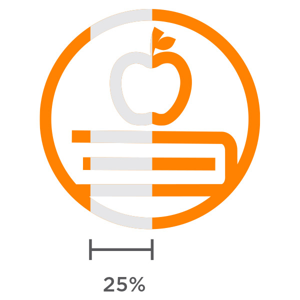
Gap spacing for a Grand Challenge icon is equal to 25% of the width and height of the icon.
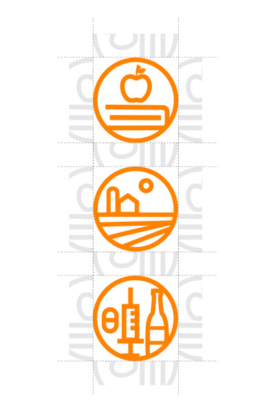
Proximity of Grand Challenge icons to each other:
Gap spacing for Grand Challenge (GC) icons when next to other GC icons follow the same rules for general clear space and is equal to 25% of the width and height of a GC icon.
Scaling
Please use the GC icons exactly as they are–do not crop, change, redraw, rotate or alter the icons in anyway.
Scale the GC icons proportionally. Select “Lock Aspect Ratio” if scaling in Word to maintain proportions and input the desired size. Or press and hold the shift key while dragging one corner of the image to create the desired size.
Color
Color options for the icons include solid orange, white and grey. Black can be used only when necessary, such as for black-and-white printing.
| Color | Name | Hex value | RGB value | CMYK value | Pantone Color |
|---|---|---|---|---|---|
| Tennessee Orange | #FF8200 | RGB (255,130,0) | CMYK (0, 50, 100, 0) | PMS 151 | |
| Smoky Mountain Gray | #58595B | RGB (88, 89, 91) | CMYK (0, 0, 0, 80) | PMS Cool Gray 11 |
Icon Usability
The understanding of an icon usually comes with time and is based on a user’s previous experience with the icon. Though not explicitly required, to help combat the ambiguity issues all icons face, it is good practice to include a text label to help clarify meaning. Below are the following ways a text label can be included with the icons.
The minimum gap spacing between the Grand Challenge icons and their text labels is equal to 25% of the width and height of the icon.
Vertical
Horizontal
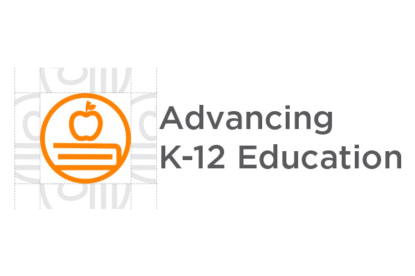
Both examples use title case in Gotham medium. For more typography guidelines, visit the typography section of media resources and style guide.
Tip: When using the icons on a web page, be sure to include the name of the icon in the alt text.